Creating emotional connections for the parent and the child.
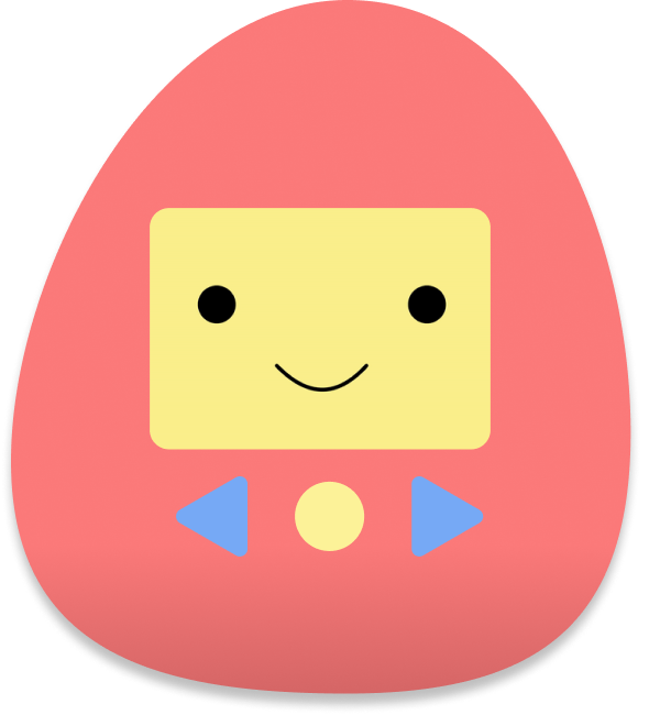
Lavalab is USC’s premier product incubator and I was able to participate in the Spring 2022 semester. Alongside one product manager and two developers, we created an emotional regulation toy called Cora. It is a physical stuffed toy paired with an app to help children better understand their feelings and parents to better connect with their kids. Our idea was to spark connection and conversation between the parent and the child in terms of emotional developement. We created a MVP for the app and the toy to pitch and demo at the final showcase at the end of the semester.
Product Designer
Jan-May 2022
Figma
Product Design
Prototyping
Branding
Joyanna Jiang
Joanna Park
Matthew Cho
Emily London
Project Roadmap
- Lack of emotional intelligence skills in adults starts from a lack of learning in childhood
- No emphasis on an emotionally intelligent education
- Exacerbated by the lack of social interaction children are experiencing in the wake of a pandemic and increasingly digitized childhood
Emotional intelligence isn’t emphasized much in formal education, often creating a disconnect between a child and their emotions. This realization stemed from personal experience and was also supported by my product manager Joanna’s interactions with her uncle and cousin. She knew that often times, her cousin would throw a tantrum and then get put in timeout. The cycle then repeated itself with no real solution so we wanted to develop a product that could aid with that.
To validate the problem, we looked to interview parents who have children around the ages 5-8 and found that many of them also realize their children struggle with regulating themselves and their emotions. Furthermore, the parents themselves do not know how to teach emotional intelligence in a constructive way.
Highlights from our interviews:
- “Regulation is so important in kids and many don’t know how to regulate themselves”
- “Teaching children how their actions impact others and how other people are feeling is challenging to do in a constructive way.”
- “The pandemic has affected these kids’ emotional health and wellbeing”
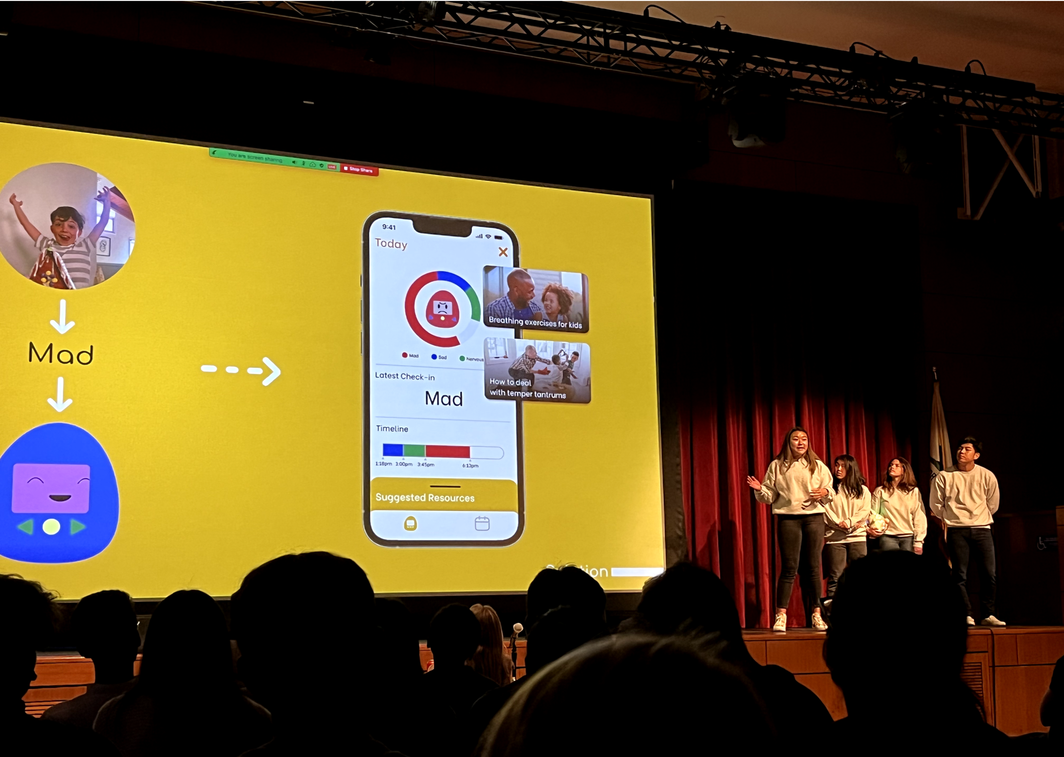
We wanted to create a toy that can converse with the child to guide them through emotionally developmental exercises, such as identifying their emotions, identifying others’ emotions, reflecting on their actions, and common emotional regulation exercises for them to process their feelings.
To come up with the feature of our product, we utilitzed the RULER method for emotional intelligence:
- R - recognizing emotions
- U - understanding the causes and consequences
- L - labeling emotions accurately
- E - expressing emotions
- R - regulating emotions
From that, we picked four common emotions and implemented exercises proven to help emotional regulation:
- Happy - Dance Party
- Mad - Wiggle
- Sad - Affirmations
- Worried - Deep Breaths
How the product works is that the child clicks the buttons on the plushie to scroll through the emotions and then chooses whichever one they reosnate with. The toy then takes them through one of the exercises listed above and the idea is that this would be connected to an app the parent monitors so they can see how their children are feeling. Exercises are all voice guided to make the toy more interactive and fun.
Cora Design Process
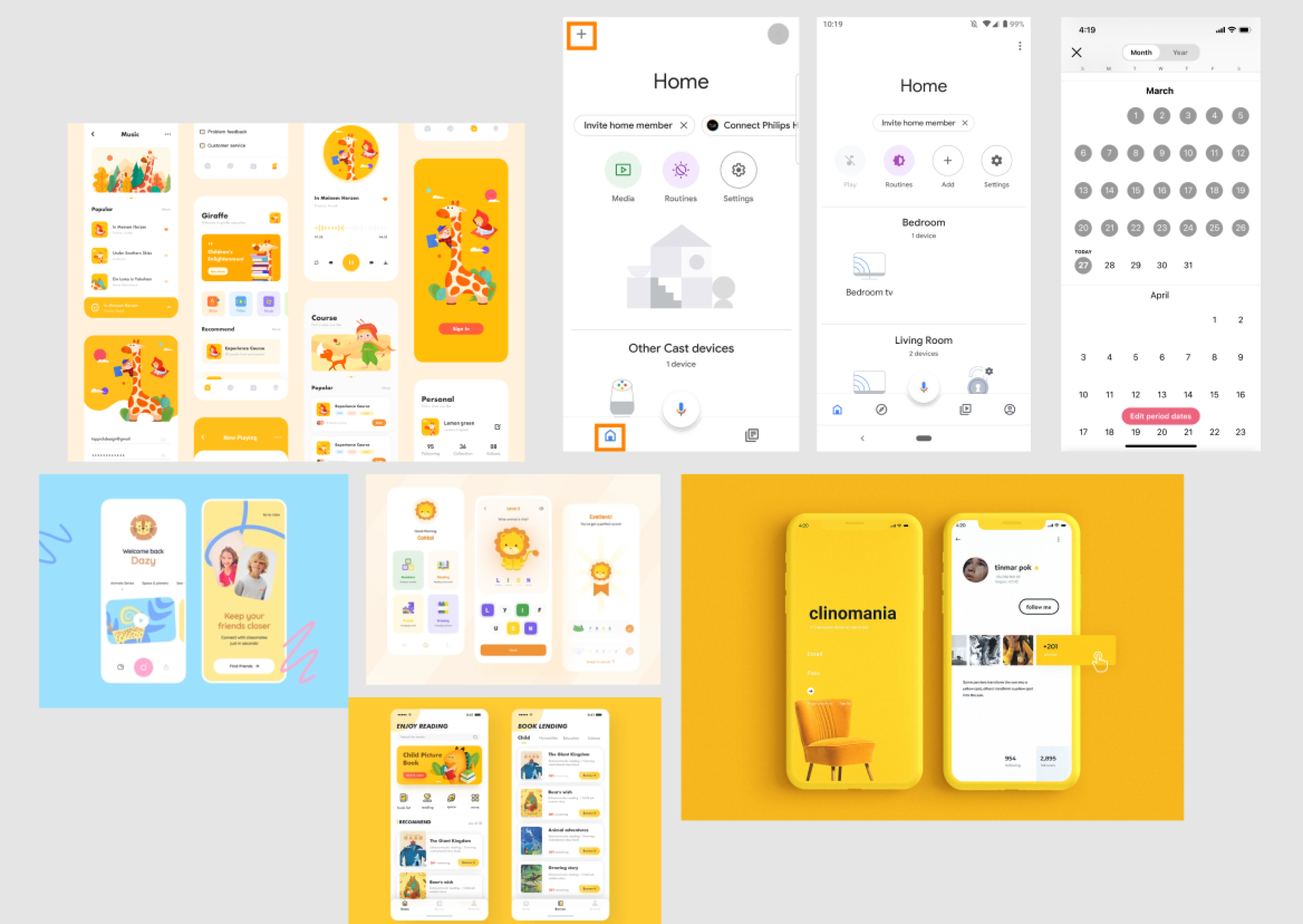
Because our product is heared towaords children, I immediately thought of fun bright colors to make the app playful and friendly. I created moodboard, primarily focusing on the color yellow to visualize how I wanted the app to look.
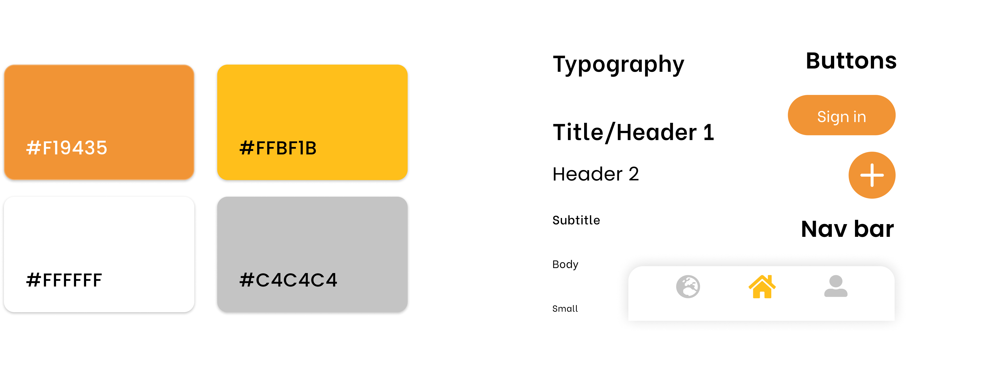
I then played around with fonts, choosing a sans-serif font to go with the friendly and less formal theme. I chose the specific colors I wanted to use and created a simple design system to follow.
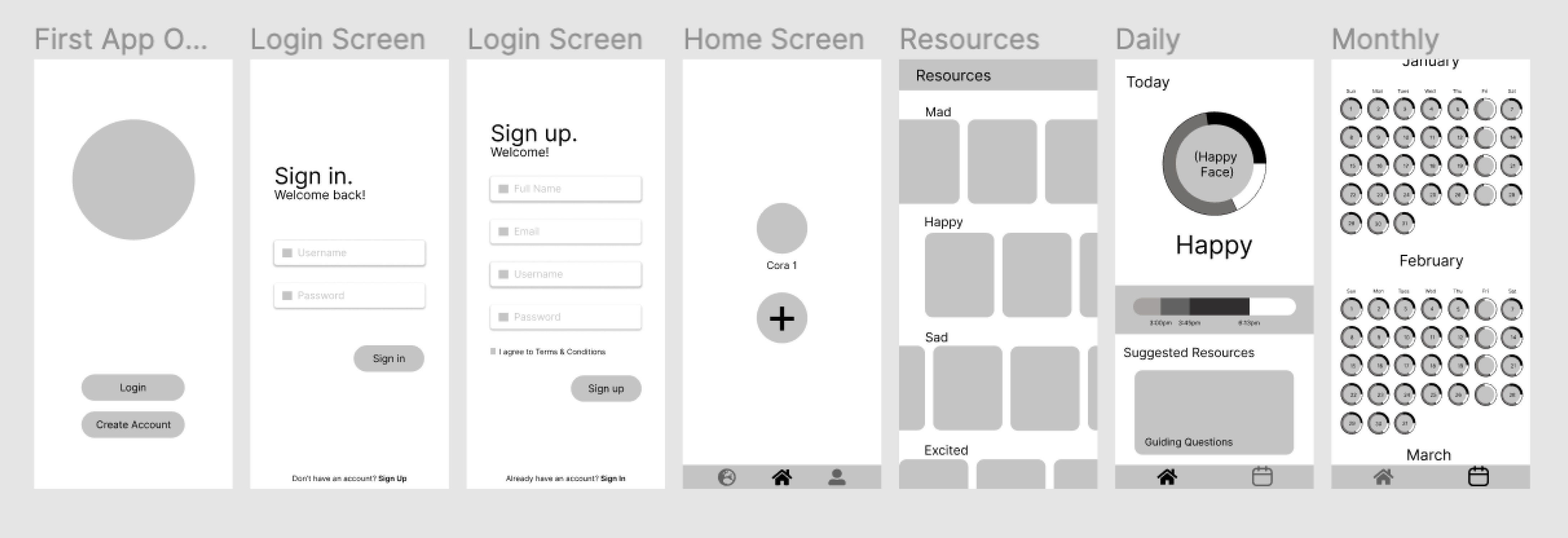
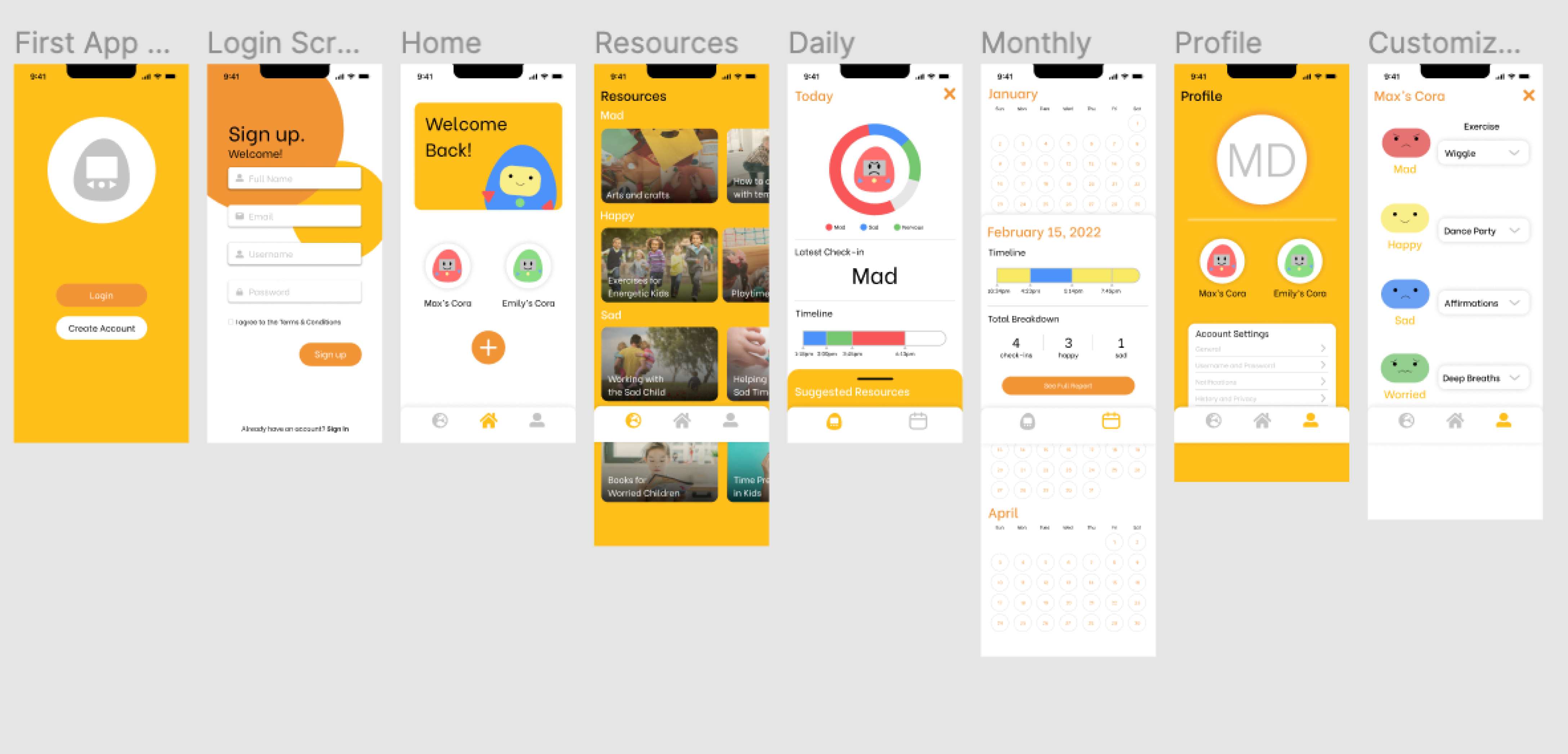
I had a lot of fun prototyping this app because this was the first time I tried using overlays and variants. To make the app more interactive, I played around with buttons and transitions such as implementing cards that can be dragged up and down. I had limited knowledge in Figma’s prototyping capabilities before this so completing this project allowed me to gain a lot of valuable experience.
View the full prototype on Figma here.
This was my first official experience working in a team of different specialists and I felt that it was an amazing opportunity to learn how to collaborate cross-functionally. As the sole designer, it felt empowering to make the final decisions on the certain designs but at the same time, I still felt supported by my team members and was able to ask them for critiques on my work. Overall, I am really proud of the final product.
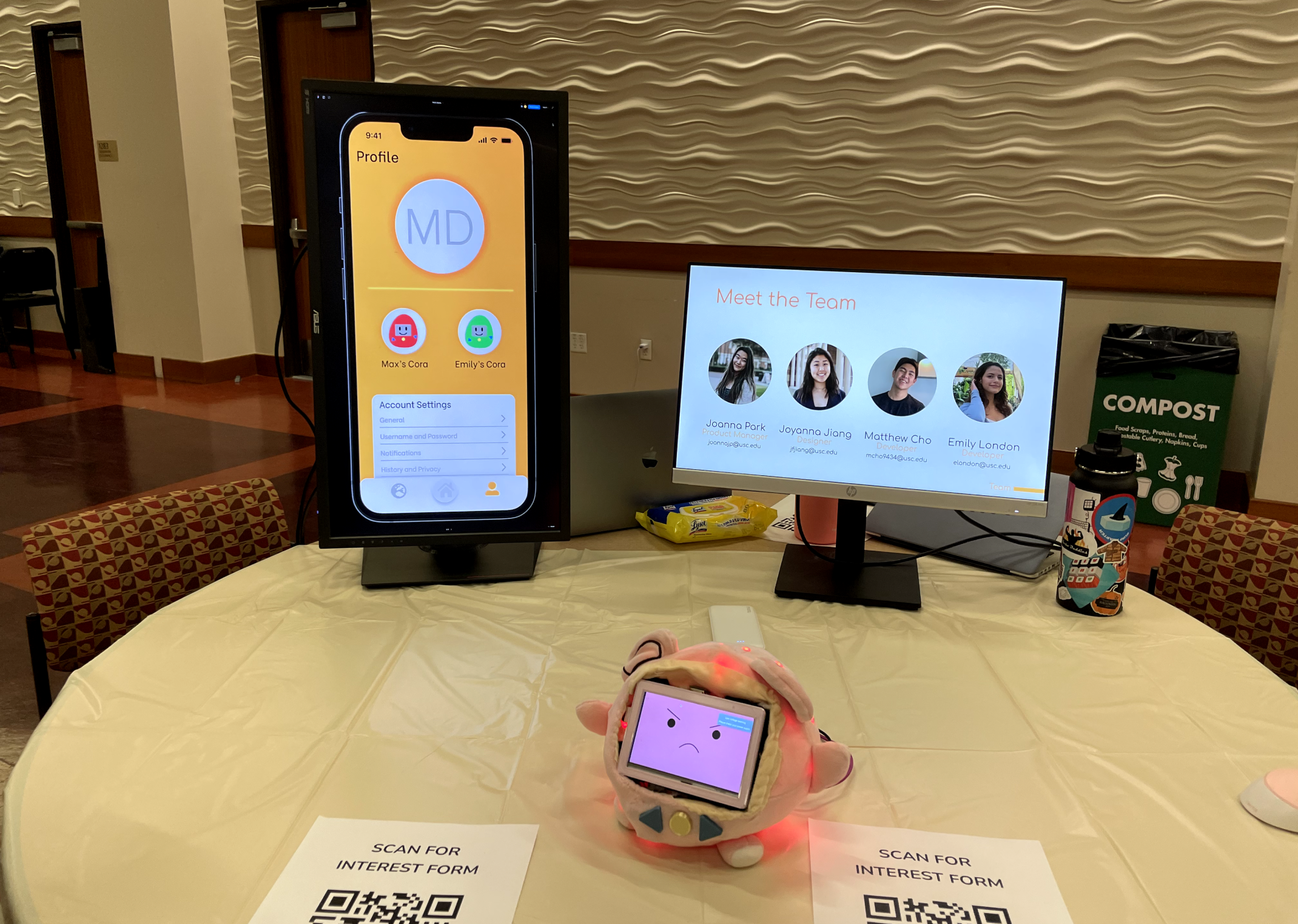
Below are some photos from our demo night!
